
Module 4: More about visualizations, aesthetics, and annotations
Looking answers for ‘data analysis with r programming module 4 challenge’?
In this post, I provide accurate answers and detailed explanations for Module 4: More about visualizations, aesthetics, and annotations of Course 7: Data Analysis with R Programming – Google Data Analytics Professional Certificate.
Whether you’re preparing for quizzes or brushing up on your knowledge, these insights will help you master the concepts effectively. Let’s dive into the correct answers and detailed explanations for each question.
1. Which of the following are benefits of using ggplot2? Select all that apply.
- Customize the look and feel of your plot ✅
- Easily add layers to your plot ✅
- Combine data manipulation and visualization ✅
- Automatically clean data before creating a plot
2. A data analyst creates a bar chart with the diamonds dataset. They begin with the following line of code:
ggplot(data = diamonds)
What symbol should the analyst put at the end of the line of code to add a layer to the plot?
- pipe operator (%>%)
- plus sign (+)
- equal sign (=)
- ampersand symbol (&)
3. A data analyst creates a plot using the following code chunk:
ggplot(data = penguins) +
geom_point(mapping = aes(x = flipper_length_mm, y = body_mass_g))
Which of the following represents a function in the code chunk? Select all that apply.
- The aes function
- The geom_point function
- the data function
- The ggplot function
4. Fill in the blank: In ggplot2, the term mapping refers to the connection between variables and _____ .
- data frames
- geoms
- facets
- aesthetics
5. A data analyst creates a scatterplot with a lot of data points. The analyst wants to make some points on the plot more transparent than others. What aesthetic should the analyst use?
- Color
- Shape
- Alpha
- Fill
6. You are working with the penguins dataset. You create a scatterplot with the following code:
ggplot(data = penguins) +
geom_point(mapping = aes(x = flipper_length_mm, y = body_mass_g))
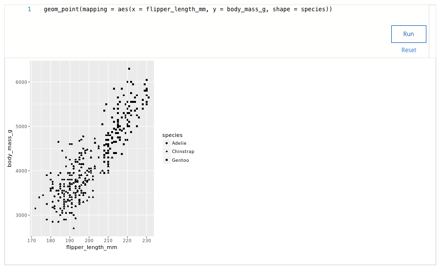
You want to highlight the different penguin species on your plot. Add a code chunk to the second line of code to map the aesthetic shape to the variable species.
NOTE: the three dots (...) indicate where to add the code chunk.
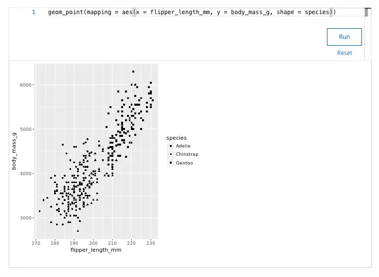
Which penguin species does your visualization display?
- Adelie, Chinstrap, Gentoo
- Emperor, Chinstrap, Gentoo
- Adelie, Chinstrap, Emperor
- Adelie, Gentoo, Macaroni
7. A data analyst creates a plot with the following code chunk:
ggplot(data = penguins) +
geom_jitter(mapping = aes(x = flipper_length_mm, y = body_mass_g))
What does the geom_jitter() function do to the points in the plot?
- Adds a small amount of random shapes at each point in the plot
- Decrease the size of each point in the plot
- Adds a small amount of random noise to each point in the plot
- Adds random colors to each point in the plot
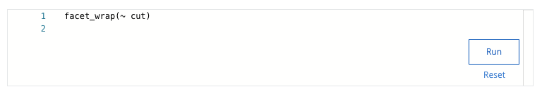
8. You are working with the diamonds dataset. You create a bar chart with the following code:
ggplot(data = diamonds) +
geom_bar(mapping = aes(x = color, fill = cut)) +
You want to use the facet_wrap() function to display subsets of your data. Add the code chunk that lets you facet your plot based on the variable clarity.
How many subplots does your visualization show?
- 9
- 6
- 8
- 7
9. Fill in the blank: You can use the _____ function to put a text label on your plot to call out specific data points.
- annotate()
- ggplot()
- facet_grid()
- geom_smooth()
10. You are working with the penguins dataset. You create a scatterplot with the following lines of code:
ggplot(data = penguins) +
geom_point(mapping = aes(x = flipper_length_mm, y = body_mass_g)) +
What code chunk do you add to the third line to save your plot as a png file with “penguins” as the file name?
- ggsave(“penguins”)
- ggsave(penguins.png)
- ggsave(“png.penguins”)
- ggsave(“penguins.png”)
11. In ggplot2, what symbol do you use to add layers to your plot?
- The pipe operator (%>%)
- The plus sign (+)
- The ampersand symbol (&)
- The equals sign (=)
12. A data analyst creates a plot using the following code chunk:
ggplot(data = buildings) +
geom_bar(mapping = aes(x = construction_year, color = height))
Which of the following represents an aesthetic attribute in the code chunk?
- ggplot
- construction_year
- buildings
- x
13. Which code snippet will make all of the bars in the plot have different colors based on their heights?
ggplot(data = buildings) +
geom_bar(mapping = aes(x = construction_year), color=height)
ggplot(data = buildings) +
geom_bar(mapping = aes(x = construction_year)) +
color(“height”)
ggplot(data = buildings) +
geom_bar(mapping = aes(x = construction_year, color=height))
ggplot(data = buildings) +
geom_bar(mapping = aes(x = construction_year)) +
color(height)
14. What is the purpose of the facet_wrap() function?
- Modify the visual characteristic of a data point
- Modify ggplot visuals to be three-dimensional
- Create text inside a plot area
- Create subplots in a grid of two variables
15. A data analyst uses the annotate() function to create a text label for a plot. Which attributes of the text can the analyst change by adding code to the argument of the annotate() function? Select all that apply.
- Change the font style of the text.
- Change the color of the text.
- Change the size of the text.
- Change the text into a title for the plot.
16. Which statement about the ggsave() function is correct?
- ggsave() exports the last plot displayed by default.
- ggsave() is run from the Plots Tab in RStudio.
- ggsave() is the only way to export a plot.
- ggsave() is unable to save .png files.
17. Which of the following statements about ggplot is true?
- ggplot allows analysts to create plots using a single function.
- ggplot is the default plotting package in base R.
- ggplot allows analysts to create different types of plots.
- ggplot is designed to make cleaning data easy.
18. A data analyst creates a plot using the following code chunk:
ggplot(data = buildings) +
geom_bar(mapping = aes(x = construction_year, color = height))
Which of the following represents a variable in the code chunk?
- construction_year
- mapping
- data
- ggplot
19. Which code snippet will make all of the bars in the plot purple?
ggplot(data = buildings) +
geom_bar(mapping = aes(x = construction_year, color=”purple”))
ggplot(data = buildings) +
geom_bar(mapping = aes(x = construction_year)) +
color(“purple”)
ggplot(data = buildings) +
geom_bar(mapping = aes(x = construction_year, color=height))
ggplot(data = buildings) +
geom_bar(mapping = aes(x = construction_year), color=”purple”)
20. A data analyst is working with the following plot and gets an error caused by a bug. What is the cause of the bug?
ggplot(data = penguins) %>%
geom_point(mapping = aes(x = flipper_length_mm, y = body_mass_g))
- The code uses a pipe instead of a plus sign.
- A missing closing parenthesis needs to be added.
- The pipe should be at the beginning of the second line.
- A function name needs to be capitalized.
21. You are working with the penguins dataset. You create a scatterplot with the following code chunk:
ggplot(data = penguins) +
geom_point(mapping = aes(x = flipper_length_mm, y = body_mass_g))
You want to highlight the different penguin species in your plot. Add a code chunk to the second line of code to map the aesthetic size to the variable bill_depth_mm.
NOTE: the three dots (...) indicate where to add the code chunk. You may need to scroll in order to find the dots.
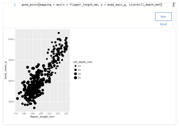
Which approximate range of bill depths does your visualization display?
- 2 – 9
- 31 – 40
- 20 – 31
- 14 – 20
22. A data analyst has a scatter plot with crowded points that make it hard to identify a trend. What geometry function can they add to their plot to clearly indicate the trend of the data?
- geom_alpha()
- geom_bar()
- geom_jitter()
- geom_smooth()
23. A data analyst wants to add a large piece of text above the grid area that clearly defines the purpose of a plot. Which ggplot function can they use to achieve this?
- subtitle()
- title()
- labs()
- annotate()
24. By default, what plot does the ggsave() function export?
- The plot define the plots.config file
- The last displayed plot
- The plot defined in the Plots Tab of R Studio
- The first plot displayed
25. Which of the following tasks can you complete with ggplot2 features? Select all that apply.
- Customize the visual features of a plot
- Automatically clean data before creating a plot
- Add labels and annotations to a plot
- Create many different types of plots
26. A data analyst is working with the following plot and gets an error caused by a bug. What is the cause of the bug?
ggplot(data = penguins)
+ geom_point(mapping = aes(x = flipper_length_mm, y = body_mass_g))
- The plus should be at the end of the first line.
- A missing closing parenthesis needs to be added.
- The code uses a plus sign instead of a pipe.
- A function name needs to be capitalized.
27. You are working with the penguins dataset. You create a scatterplot with the following code chunk:
ggplot(data = penguins) +
geom_point(mapping = aes(x = flipper_length_mm, y = body_mass_g))
You want to highlight the different penguin species in your plot. Add a code chunk to the second line of code to map the aesthetic shape to the variable species.
NOTE: the three dots (...) indicate where to add the code chunk. You may need to scroll in order to find the dots.
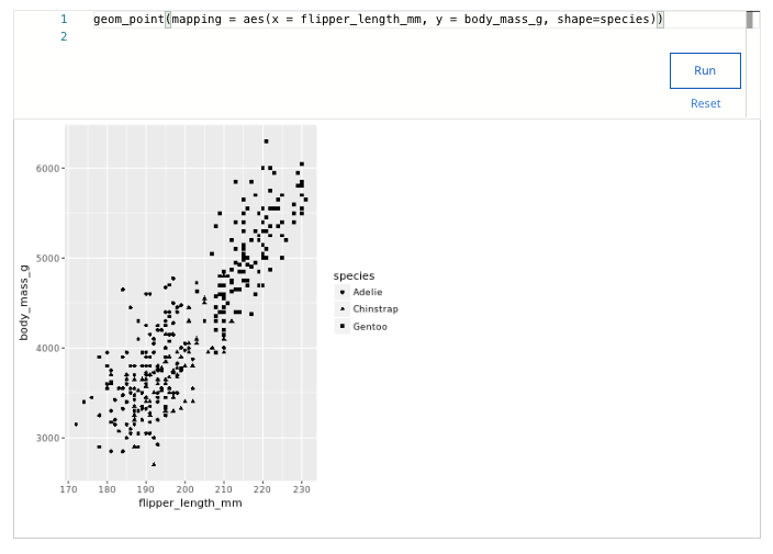
Which species tends to have the longest flipper length and highest body mass?
- Gentoo
- Macaroni
- Adelie
- Chinstrap
28. A data analyst creates a scatterplot where the points are very crowded, which makes it hard to notice when points are stacked. What change can they make to their scatter plot to make it easier to notice the stacked data points?
- Change geom_point() to geom_jitter()
- Change ggplot() to ggplot2()
- Change the color of the points
- Change the shape of the points
29. Which code snippet will make all of the bars in the plot have different colors and shapes based on their heights?
ggplot(data = buildings) +
geom_bar(mapping = aes(x = construction_year, color=[height, height]))
ggplot(data = buildings) +
geom_bar(mapping = aes(x = construction_year, color=height, shape=height))
ggplot(data = buildings) +
geom_bar(mapping = aes(x = construction_year, color=height), aes(shape=height))
ggplot(data = buildings) +
geom_bar(mapping = aes(x = construction_year)) +
color(height) +
shape(height)
30. You are working with the penguins dataset. You create a scatterplot with the following code:
ggplot(data = penguins) +
geom_point(mapping = aes(x = flipper_length_mm, y = body_mass_g))
You want to highlight the different years of data collection on your plot. Add a code chunk to the second line of code to map the aesthetic size to the variable year.
NOTE: the three dots (...) indicate where to add the code chunk. You may need to scroll in order to find the dots.
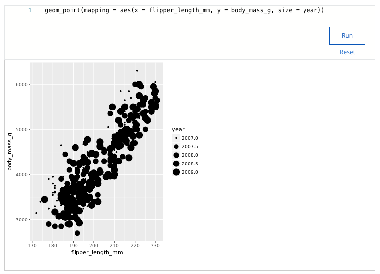
What years does your visualization display?
- 2006-2010
- 2005-2009
- 2007-2009
2007-2011
31. Fill in the blank: The _____ creates a scatterplot and then adds a small amount of random noise to each point in the plot to make the points easier to find.
- geom_jitter() function
- geom_point() function
- geom_bar() function
- geom_smooth() function
32. A data analyst creates a plot using the following code chunk:
ggplot(data = buildings) +
geom_bar(mapping = aes(x = construction_year, color = height))
Which of the following represents a function in the code chunk?
- The height function
- The x function
- The ggplot function
- The mapping function
33. A data analyst is working with the following plot and gets an error caused by a bug. What is the cause of the bug?
ggplot(data = penguins) +
geom_point(mapping = aes(x = flipper_length_mm, y = body_mass_g)
- A missing closing parenthesis needs to be added.
- The plus sign should be at the beginning of the second line.
- The code uses a plus sign instead of a pipe.
- A function name needs to be capitalized.
34. Which of the following statements best describes a facet in ggplot?
- Facets are the ggplot terminology for a chart axis.
- Facets are subplots that display data for each value of a variable.
- Facets are the visual characteristics of geometry objects.
- Facets are the text used in and around plots.
35. Which of the following is a functionality of ggplot2?
- Combine data manipulation and visualizations using pipes.
- Filter and sort data in complex ways.
- Define complex visualization using a single function.
- Create plots using artificial intelligence.
36. Which ggplot function is used to define the mappings of variables to visual representations of data?
- annotate()
- mapping()
- aes()
- ggplot()
37. You are working with the penguins dataset. You create a scatterplot with the following code chunk:
ggplot(data = penguins) +
geom_point(mapping = aes(x = flipper_length_mm, y = body_mass_g))
You want to highlight the different years of data collection on your plot. Add a code chunk to the second line of code to map the aesthetic alpha to the variable island.
NOTE: the three dots (...) indicate where to add the code chunk. You may need to scroll in order to find the dots.
What islands does your visualization display?
- Biscoe, Dream, Torgersen
- Cebu, Borneo, Torgersen
- Cebu, Java, Hispaniola
- Biscoe, Java, Buton
38. What function creates a scatterplot and then adds a small amount of random noise to each point in the plot to make the points easier to find?
- The geom_smooth() function
- The geom_jitter() function
- The geom_point() function
- The geom_bar() function
39. A data analyst wants to add text elements inside the grid area of their plot. Which ggplot function allows them to do this?
- annotate()
- labs()
- facet()
- text()
40. You are working with the penguins dataset. You create a scatterplot with the following lines of code:
ggplot(data = penguins) +
geom_point(mapping = aes(x = flipper_length_mm, y = body_mass_g)) +
What code chunk do you add to the third line to save your plot as a pdf file with “penguins” as the file name?
- ggsave(penguins.pdf)
- ggsave(“pdf.penguins”)
- ggsave(=penguins)
- ggsave(“penguins.pdf”)
41. A data analyst creates a plot using the following code chunk:
ggplot(data = penguins) +
geom_point(mapping = aes(x = flipper_length_mm, y = body_mass_g))
Which of the following represents an aesthetic attribute in the code chunk? Select all that apply.
- flipper_length_mm
- body_mass_g
- y
- x
42. What argument of the labs() function can a data analyst use to add text outside of the grid area of a plot?
- text
- note
- title
- annotate
43. In R studio, what default options does the Export functionality of the Plots tab give for exporting plots?
- HTML
- Image
- Slideshow
44. Fill in the blank: In ggplot2, you use the _____ to add layers to your plot.
- The plus sign (+)
- The pipe operator (%>%)
- The equals sign (=)
- The ampersand symbol (&)
45. A data analyst is working with the penguins data. The analyst creates a scatterplot with the following code:
ggplot(data = penguins) +
geom_point(mapping = aes(x = flipper_length_mm, y = body_mass_g, alpha = species))
What does the alpha aesthetic do to the appearance of the points on the plot?
- Makes the points on the plot larger
- Makes some points on the plot more transparent
- Makes the points on the plot smaller
- Makes the points on the plot more colorful
46. You are working with the diamonds dataset. You create a bar chart with the following code:
ggplot(data = diamonds) +
geom_bar(mapping = aes(x = color, fill = cut)) +
You want to use the facet_wrap() function to display subsets of your data. Add the code chunk that lets you facet your plot based on the variable cut.
How many subplots does your visualization show?
- 3
- 4
- 5
- 6
Related contents:
Module 1: Programming and data analytics
Module 2: Programming using RStudio
Module 3: Working with data in R
Module 5: Documentation and reports
Module 5: Course challenge
You might also like:
Course 1: Foundations: Data, Data, Everywhere
Course 2: Ask Questions to Make Data-Driven Decisions
Course 3: Prepare Data for Exploration
Course 4: Process Data from Dirty to Clean
Course 5: Analyze Data to Answer Questions
Course 6: Share Data Through the Art of Visualization
Course 8: Google Data Analytics Capstone: Complete a Case Study