design a user experience for social good and prepare for jobs week 4 answers
Test your knowledge on common website layouts
1. What is the focal point on this website?
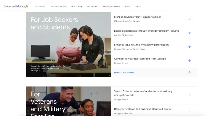
- The headers, which inform the user about how to find key information
- The arrows, which are blue, and direct users where to find more details
- The navigation bar, which is clearly anchored at the top of the page
- The images, which draw a user’s attention to the categories
2. In a responsive website design, the content that's above the fold should include the most important information for the user flow.
- True
- False
3. A designer creates a website with individual rows stacked on top of each other. Within each row, the designer includes a series of columns. What website layout is the designer using?
- Asymmetrical layout
- Grid of cards layout
- Tiered layer cake layout
- Featured image layout
Test your knowledge on creating wireframes
4. Imagine that a designer creates wireframes for a mobile responsive website. Then they want to create wireframes for the companion desktop site and its larger screen size. They start with the mobile wireframe, and plot it on dot paper. What steps come next? Select all that apply.
- Apply a template that matches the project specifications
- Add elements and components to the wireframes
- Create wireframes for smaller screen sizes
- Scale up the wireframes two or three times larger
5. What should a designer do with text when scaling up a wireframe from mobile to desktop?
- Revise the site’s information architecture
- Increase the size of the text
- Adopt a desktop-friendly typeface
- Reposition text below the hero image
6. Fill in the blank: Designers can _____, scale, and resize content in wireframes for different screen sizes.
- rearrange
- undo
- fold
- contain
Optional - Test your knowledge on planning and conducting usability studies
7. What is the goal of a usability study?
- Determine how product features can accommodate a participant’s design preferences
- Share rough design sketches to generate participant feedback early in the design process
- Develop a research plan and confirm the correct sample size of participants
- Assess how easy it is for participants to complete core tasks in a product
8. A UX designer creates a website for a regional health nonprofit. They plan a usability study, recruit participants, and conduct the study. Then, they iterate on the initial design, and share the updated website with their client. What step did the designer skip in conducting this study?
- Establish the website’s information architecture
- Write a research report
- Analyze and synthesize observations
- Decide which product to test
9. How many times is it appropriate to conduct usability studies?
- One usability study is sufficient
- Twice, once before the project begins and after the product is released
- As many times as needed
Test your knowledge on designing mockups
10. Mockups should adhere to visual design principles, and include design elements like typography, color, and iconography.
- True
- False
11. Imagine a design team is building a mockup of a responsive website. Based on preliminary marketing research, they know a significant proportion of users will access the website using smartphones and tablets. What principles should they apply to improve cross-platform design? Select all that apply.
- Reach out to the back-end developers to ask about changing website architecture
- Resize text, icons, images, buttons, and navigation bars to fit better on a responsive grid
- Wait until user research is complete before deciding on typography, color, and iconography
- Consider how to change design elements and components to fit a new screen size
12. When creating mockups of a responsive website, the design team should create mockups for various screen sizes.
- True
- False
Test your knowledge on UX portfolio case studies
13. Imagine that you finish this program, and compile a concise and engaging case study about your responsive website to add to your portfolio. The case study includes the project goals and objectives, your role, the insights you gained through research, and what you learned from the project. What’s missing from this case study? Select all that apply.
- Challenges and constraints
- Outcome of the project
- Feedback on the project
- Design process and artifacts
14. When developing a case study, what artifacts should you include from a project? Select all that apply.
- Wireframes
- Prototypes
- Design sketches from previous projects
- Final designs
Thank you so much this was very helpful