Module 4: Become a fair and impactful data professional
Looking for ‘foundations data data everywhere module 4 answers‘?
In this post, I provide accurate answers and detailed explanations for Module 4: Become a fair and impactful data professional of Course 1: Foundations: Data, Data, Everywhere – Google Data Analytics Professional Certificate.
Whether you’re preparing for quizzes or brushing up on your knowledge, these insights will help you master the concepts effectively. Let’s dive into the correct answers and detailed explanations for each question.
Test your knowledge on spreadsheet basics
Practice Quiz
1. In a spreadsheet, what is text wrapping used for?
- To allow all of the text to fit inside a cell ✅
- To allow text to overflow into an adjacent cell
- To remove text that is too long to fit in a cell
- To clip text within a cell so it doesn’t overflow into an adjacent cell
Explanation:
Text wrapping is used to make all the text in a cell visible by wrapping the text to fit within the cell’s boundaries. This prevents text from being cut off or overflowing into adjacent cells, ensuring readability without affecting the layout of the spreadsheet.
2. By default the columns in a spreadsheet are ordered by letter, and the rows are ordered by number.
- True ✅
- False
Explanation:
Spreadsheet applications like Excel and Google Sheets label columns with letters (A, B, C, etc.) and rows with numbers (1, 2, 3, etc.). This grid-like structure helps in identifying cells using a combination of column letters and row numbers, such as A1 or B2.
3. Fill in the blank: In a data table, a row is called an observation. An observation includes all of the _____ for what is contained in the row.
- diagnostics
- commonalities
- names
- attributes ✅
Explanation:
In a data table, each row represents an observation, and the attributes are the pieces of data or variables that describe that observation. For example, in a table of employee data, an observation might represent an employee, and the attributes would include the employee’s name, age, job title, etc.
Test your knowledge on SQL
Practice Quiz
4. What does the asterisk (*) after SELECT tell the database to do in this query?
- Select the LastName column from the employee table
- Select all columns from the employee table ✅
- Select all data that meets the criteria as stated in the query, then multiply it
- Select all data that meets the criteria as stated in the query
Explanation:
The asterisk (*) in an SQL SELECT statement indicates that all columns in the specified table (in this case, employee
) should be included in the result set.
5. In this query, the data analyst wants to retrieve data from which table?
- jobCode
- LastName
- employee ✅
- James
Explanation:
The FROM employee
clause specifies the table from which the data will be retrieved. In this query, the data is being retrieved from the employee
table.
6. In this query, what will be retrieved from the database?
- All data from the employee table, where the jobCode is FTE and the last name is James. ✅
- All data from the FTE table, where the employee’s LastName is James.
- All data from the jobCode table, where the jobCode is FTE and the employee has any last name other than James.
- All data from the employee table, where the jobCode is FTE and the employee has any last name other than James.
Explanation:
The query uses the WHERE
clause to filter results. It retrieves all rows from the employee
table where the jobCode
is 'FTE'
and the LastName
is 'James'
. Since *
is used, all columns for these rows will be returned.
7. You are working with a database table that contains data about music artists. The table is named artist. You want to review all the columns in the table.
You write the SQL query below. Add a FROM clause that will retrieve the data from the artist table.
How many columns are in the artist table?
- 2 ✅
- 8
- 5
- 9
Explanation:
The FROM
clause specifies the table (artist
) from which data should be retrieved. The asterisk (*) indicates that all columns in the artist
table should be included in the result set.
How many columns are in the artist
table?
8. You are working with a database table that contains data about music albums. You are only interested in data related to the album with ID number 277. The album IDs are listed in the album_id column from the album table.
You write the SQL query below. Add a WHERE clause that will return only data about the album with ID number 277.
What is the name of the album with ID number 277?
- Vivaldi: The Four Seasons
- Beethoven: Piano Sonatas
- Mozart: Chamber Music
- Bach: Goldberg Variations ✅
Test your knowledge on visualizing data
Practice Quiz
9. Fill in the blank: A data visualization is the _____ representation of information.
- graphical ✅
- tabulated
- contextual
- attributed
Explanation:
Data visualizations use graphical elements such as charts, graphs, and plots to represent information, making complex data easier to understand.
10. When would a pie chart be an effective visualization?
- When showing a class broken down by age ✅
- When showing the ages of males versus females
- When showing the relationship between age and income
- When showing a change in someone’s age over time
Explanation:
A pie chart is most effective when displaying proportions or percentages of a whole, such as the breakdown of a class by age groups. It is not suitable for comparisons or trends over time.
11. What are the key benefits of data visualizations? Select all that apply.
- They can ensure that you get fewer questions about your analysis
- They can illustrate relationships between data points ✅
- They can help stakeholders understand complex data more quickly ✅
- They can clearly demonstrate patterns and trends ✅
Explanation:
Data visualizations are powerful tools that make it easier to identify relationships, patterns, and trends in data. They also help stakeholders quickly grasp complex information. However, visualizations do not necessarily reduce the number of questions about your analysis, as stakeholders might ask for more details or clarifications.
*Module 4 challenge*
Graded Quiz
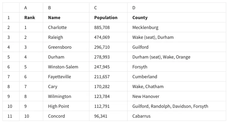
12. In the following spreadsheet, the column labels in row 1 are called what?
- Criteria
- Attributes ✅
- Descriptors
- Characteristics
13. Fill in the blank: In row 8 of the following spreadsheet, you can find the _____ of Cary.
- format
- attribute
- criteria
- observation ✅
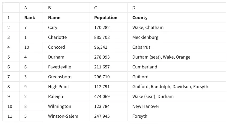
14. Fill in the blank: In the following spreadsheet, the _____ feature was used to alphabetize the city names in column B.
- Organize range
- Name range
- Randomize range
- Sort range ✅
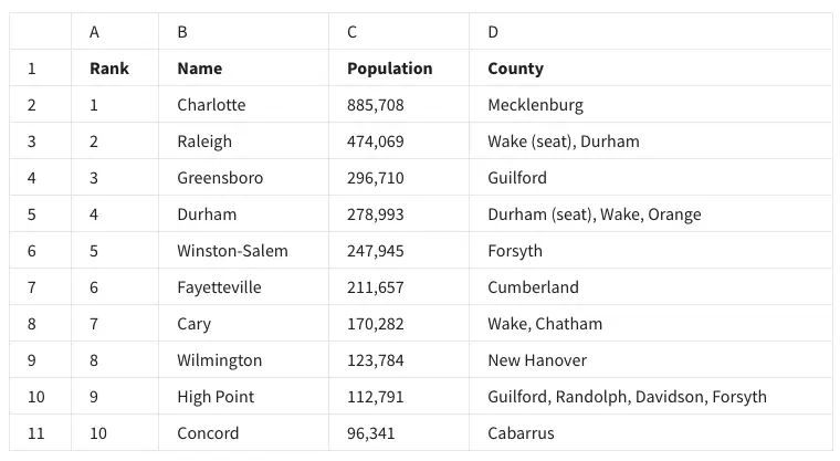
15. A data analyst types =POPULATION(C2:C11) to find the average population of the cities in this spreadsheet. However, they realize they used the wrong formula. What syntax will correct this function?
- =AVERAGE(C2-C11)
- AVERAGE(C2:C11)
- AVERAGE(C2-C11)
- =AVERAGE(C2:C11) ✅
16. You are working with a database table named genre that contains data about music genres. You want to review all the columns in the table.
You write the SQL query below. Add a FROM clause that will retrieve the data from the genre table.
What is the name of the genre with ID number 3?
- Jazz
- Rock
- Metal ✅
- Blues
17. You are working with a database table that contains invoice data. The customer_id column lists the ID number for each customer. You are interested in invoice data for the customer with ID number 35.
You write the SQL query below. Add a WHERE clause that will return only data about the customer with ID number 35.
After you run your query, use the slider to view all the data presented.
What is the billing country for the customer with ID number 35?
- Ireland
- Argentina
- Portugal ✅
- India
18. A data analyst creates the following visualization to clearly demonstrate how much more populous Charlotte is than the next-largest North Carolina city, Raleigh. What type of chart is it?
- A scatter chart
- A column, or bar, chart ✅
- A line chart
- A pie chart
19. A data analyst wants to demonstrate a trend of how something has changed over time. What type of chart is best for this task?
- Area
- Column
- Line ✅
- Bar
20. Fill in the blank: In row 1 of the following spreadsheet, the words rank and name are called _____?
- attributes ✅
- characteristics
- criteria
- descriptors
Explanation:
In a spreadsheet or database context, the terms in the first row, like “Rank” and “Name,” represent attributes or column headers that describe the type of data contained within each column.
21. In the following spreadsheet, where can you find all of the attributes—also known as the observation—of Fayetteville?
- Row 7 ✅
- Column B
- Row 6
- Cell B7
22. Fill in the blank: In the following spreadsheet, the feature sort range can be used to ________ the city names in column B?
- change
- alphabetize ✅
- randomize
- delete
23. The function =AVERAGE(C2:C11) can be used to do what for the following spreadsheet?
- Arrange the rows according to increasing population size.
- Find the city with the largest population.
- Arrange the rows according to decreasing population size.
- Find the average population of the cities ✅
24. You are working with a database table named employee that contains data about employees. You want to review all the columns in the table.
You write the SQL query below. Add a FROM clause that will retrieve the data from the employee table.
What employee has the job title of Sales Manager?
- Nancy Edwards ✅
- Margaret Park
- Michael Mitchell
- Andrew Adams
Explanation:
Using the query SELECT * FROM employee
, you can retrieve all data from the “employee” table. The correct data identifies “Nancy Edwards” as the Sales Manager.
25. You are working with a database table that contains invoice data. The customer_id column lists the ID number for each customer. You are interested in invoice data for the customer with ID number 40.
You write the SQL query below. Add a WHERE clause that will return only data about the customer with ID number 40.
After you run your query, use the slider to view all the data presented.
What is the billing city for the customer with ID number 40?
- Paris ✅
- Dijon
- London
- Buenos Aires
26. A data analyst has to create a visualization that makes it easy to show which of the top ten most populous cities in North Carolina have a population below 250,000 people. What type of chart would be best for this visualization?
- Line chart
- Pie chart
- Bar chart ✅
- Scatter chart
Explanation:
A bar chart is ideal for comparing populations because it visually represents data using bars, making it easy to identify cities with populations below 250,000.
27. A data analyst wants to demonstrate how the population in Charlotte has increased over time. They create this data visualization. This is an example of an area chart.
- True
- False ✅
28. In row 1 of the following spreadsheet, the words rank, name, population, and county are called what?
- Attributes ✅
- Descriptors
- Criteria
- Characteristics
29. In the following spreadsheet, what feature was used to alphabetize the city names in column B?
- Organize range
- Sort range ✅
- Name range
- Randomize range
30. To find the average population of the cities in this spreadsheet, you type =AVERAGE. What is the proper way to type the range that will complete your function?
- (C2,C11)
- (C2-C11)
- (C2:C11) ✅
- (C2*C11)
31. You are working with a database table named playlist that contains data about playlists for different types of digital media. You want to review all the columns in the table.
You write the SQL query below. Add a FROM clause that will retrieve the data from the playlist table.
What is the playlist with ID number 3?
- Audiobooks
- Music
- Movies
- TV Shows ✅
32. You are working with a database table that contains invoice data. The customer_id column lists the ID number for each customer. You are interested in invoice data for the customer with ID number 28.
You write the SQL query below. Add a WHERE clause that will return only data about the customer with ID number 28.
After you run your query, use the slider to view all the data presented.
What is the billing city for the customer with ID number 28?
- Bangalore
- Buenos Aires
- Dijon
- Salt Lake City ✅
33. Which of the following best describes a bar chart?
- It is a visualization that uses a circle which is divided into wedges sized based on numerical proportion.
- It is a visualization that plots a sequence of points and connects them with them with straight lines or curves.
- It is a visualization that represents data with columns, or bars, the heights of which are proportional to the values that they represent. ✅
- It is a visualization that plots individual points in the Cartesian coordinate plane.
34. A data analyst has to create a visualization that clearly shows when and for how long the population of Charlotte has been above one million people. They choose to use a line chart. Why is this the best choice for their visualization?
- It is a visualization that plots a sequence of points and connects them with straight lines or curves. ✅
- It is a visualization that uses a circle which is divided into wedges sized based on numerical proportion.
- It is a visualization that represents data with columns, or bars, the heights of which are proportional to the values that they represent.
- It is a visualization that plots individual points in the Cartesian coordinate plane.
35. The words rank, name, population, and county in row 1 of the following spreadsheet are known as descriptors.
- True
- False ✅
36. Fill in the blank: In the following spreadsheet, the ________ of High Point describes all of the data in row 10.
- criteria
- dataset
- observation ✅
- format
Explanation:
An observation refers to a single record or data entry, which in this case is the entire row containing details about “High Point.”
37. If a data analyst wants to list the cities in this spreadsheet alphabetically, instead of numerically, what feature can they use in column B?
- Sort range ✅
- Name range
- Randomize range
- Organize range
38. A data analyst wants to create a visualization that depicts the populations of the top ten most populous cities in North Carolina. What type of chart would be best for this?
- A pie chart
- A scatter chart
- A column, or bar, chart ✅
- A line chart
39. A data analyst has to demonstrate a trend of how something has changed over time. What type of chart is best for this task?
- Line ✅
- Area
- Bar
- Column
40. You are working with a database table that contains invoice data. The customer_id column lists the ID number for each customer. You are interested in invoice data for the customer with ID number 54.
You write the SQL query below. Add a WHERE clause that will return only data about the customer with ID number 54.
After you run your query, use the slider to view all the data presented.
What is the billing address for the customer with ID number 54?
- 1033 N Park Ave
- 230 Elgin St
- 110 Raeburn Pl ✅
- 801 W 4th St
41. Fill in the blank: A data analyst creates a table, but they realize this isn’t the best visualization for their data. To fix the problem, they decide to use the ____ feature to change it to a column chart.
- chart editor ✅
- rename
- filter view
- image
42. You are working with a database table named employee that contains data about employees. You want to review all the columns in the table.
You write the SQL query below. Add a FROM clause that will retrieve the data from the employee table.
What is the job title of Andrew Adams?
- General Manager ✅
- Sales Manager
- Sales Support Agent
- IT Manager
43. Fill in the blank: Suppose you wanted to determine the average population of the cities in the following spreadsheet. The correct function syntax to use would be ________ .
- =AVERAGE(C2-C11)
- AVERAGE(D2:D11)
- AVERAGE(C2:C11)
- =AVERAGE(C2:C11) ✅
Explanation:
The AVERAGE
function calculates the mean of the values in the specified range. Here, C2:C11
includes all the population values.
44. A data analyst wants to list the cities in this spreadsheet alphabetically, instead of numerically. They can use the feature sort range to do this.
- True ✅
- False
45. In the following spreadsheet, the observation of Greensboro describes all of the data in row 4.
- True ✅
- False
46. A company is curious about the population trend in Charlotte, NC. A data analyst in the company is tasked with creating a visualization that depicts such information. What type of chart would be best for this task and why?
- A pie chart because it plots a sequence of points and connects them with straight lines or curves.
- A line chart because it plots a sequence of points and connects them with straight lines or curves. ✅
- A line chart because it is a visualization that uses a circle which is divided into wedges sized based on numerical proportion.
- A bar chart because it is a visualization that represents data with columns, or bars, the heights of which are proportional to the values that they represent.
Explanation:
A line chart is suitable for showing trends over time. It effectively displays changes in population by connecting data points sequentially.
47. To find the average population of the cities in this spreadsheet, what is the correct AVERAGE function syntax? Type your answer below.
- AVERAGE(C2-C11)
- =AVERAGE(C2-C11)
- =AVERAGE(C2:C11) ✅
- AVERAGE(C2:C11)
48. You are working with a database table that contains invoice data. The customer_id column lists the ID number for each customer. You are interested in invoice data for the customer with ID number 50.
You write the SQL query below. Add a WHERE clause that will return only data about the customer with ID number 50.
After you run your query, use the slider to view all the data presented.
What is the billing city for the customer with ID number 50?
- Paris
- Bangalore
- Tokyo
- Madrid ✅
49. Fill in the blank: A data analyst has to demonstrate how the population in a city has increased over time. In particular, they want to be able to see when the population has exceeded certain thresholds. The chart that would work best for this is a/an _____ chart.
- area
- line ✅
- bar
- column
50. The function =AVG_pop(C2:C11) will calculate the average population across the cities in this spreadsheet.
- True
- False ✅
51. A data analyst has to demonstrate how the population in Charlotte has increased over time. They create the chart below. What is this type of chart called?
- Area chart
- Column chart
- Line chart ✅
- Bar chart
52. In the following spreadsheet, the feature sort range was used to do what?
- Randomize the rank
- Randomize the population
- Alphabetize column B ✅
- Alphabetize column D
Explanation:
Sorting the range has reordered the data in column B (the “Name” column) alphabetically while keeping the rest of the data aligned with each corresponding row.
53. You are working with a database table that contains invoice data. The customer_id column lists the ID number for each customer. You are interested in invoice data for the customer with ID number 7.
You write the SQL query below. Add a WHERE clause that will return only data about the customer with ID number 7.
After you run your query, use the slider to view all the data presented.
What is the billing country for the customer with ID number 7?
- France
- Austria ✅
- Poland
- Brazil
Related contents:
Module 1: Introducing data analytics and analytical thinking
Module 2: The wonderful world of data
Module 3: Set up your data analytics toolbox
Module 5: Endless career possibilities
Module 5: *Course challenge*
You might also like:
Course 2: Ask Questions to Make Data-Driven Decisions
Course 3: Prepare Data for Exploration
Course 4: Process Data from Dirty to Clean
Course 5: Analyze Data to Answer Questions
Course 6: Share Data Through the Art of Visualization
Course 7: Data Analysis with R Programming
Course 8: Google Data Analytics Capstone: Complete a Case Study