Module 4: Become a Fair and Impactful Data Professional Answers (Part 2: Q16–30)
This is Part 2 of the Module 1 quiz answers for “Become a Fair and Impactful Data Professional” from the Google Data Analytics Professional Certificate on Coursera.
Here, we’ll walk through questions 16 to 30 with detailed explanations to support your learning.
To find answers to the remaining questions, check out the full module breakdown below:
16. You are working with a database table named genre that contains data about music genres. You want to review all the columns in the table.
You write the SQL query below. Add a FROM clause that will retrieve the data from the genre table.

What is the name of the genre with ID number 3?
- Jazz
- Rock
- Metal ✅
- Blues
Explanation:
The query SELECT * FROM genre;
retrieves all columns from the “genre” table. If the genre with ID number 3 is “Metal,” this information will be displayed in the result set.
17. You are working with a database table that contains invoice data. The customer_id column lists the ID number for each customer. You are interested in invoice data for the customer with ID number 35.
You write the SQL query below. Add a WHERE clause that will return only data about the customer with ID number 35.

After you run your query, use the slider to view all the data presented.
What is the billing country for the customer with ID number 35?
- Ireland
- Argentina
- Portugal ✅
- India
Explanation:
The query SELECT * FROM invoices WHERE customer_id = 35;
filters the data to return the invoice(s) for customer ID 35. If the country listed for that customer in the data is “Portugal”, then that is the correct answer.
18. A data analyst creates the following visualization to clearly demonstrate how much more populous Charlotte is than the next-largest North Carolina city, Raleigh. What type of chart is it?

- A scatter chart
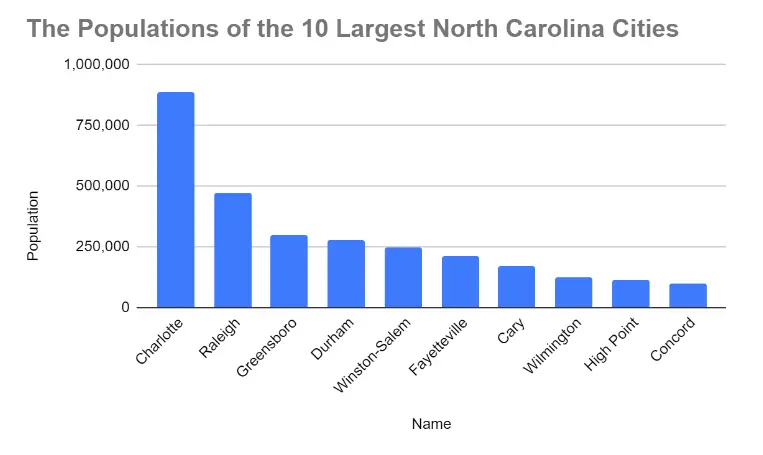
- A column, or bar, chart ✅
- A line chart
- A pie chart
Explanation:
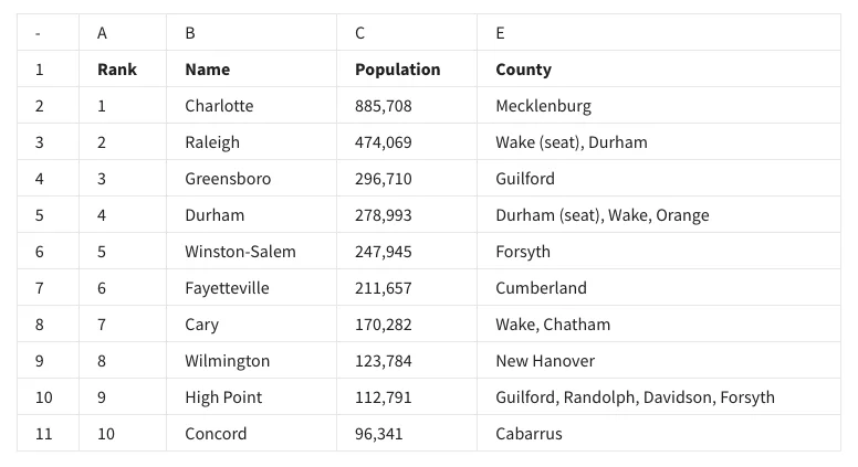
A bar chart is effective for comparing the populations of different cities, making it clear how much more populous Charlotte is compared to Raleigh.
19. A data analyst wants to demonstrate a trend of how something has changed over time. What type of chart is best for this task?
- Area
- Column
- Line ✅
- Bar
Explanation:
Line charts are ideal for showing trends over time, as they effectively display changes and patterns in data across a continuous timeline.
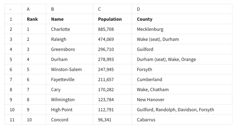
20. Fill in the blank: In row 1 of the following spreadsheet, the words rank and name are called _____?

- attributes ✅
- characteristics
- criteria
- descriptors
Explanation:
In a spreadsheet or database context, the terms in the first row, like “Rank” and “Name,” represent attributes or column headers that describe the type of data contained within each column.
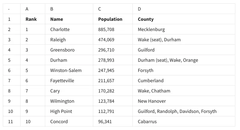
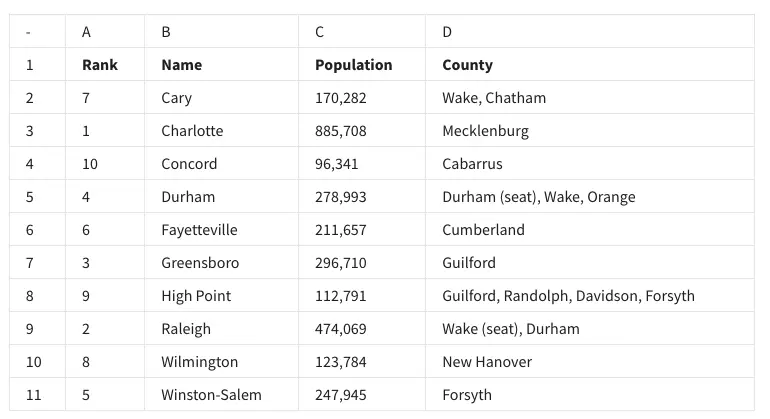
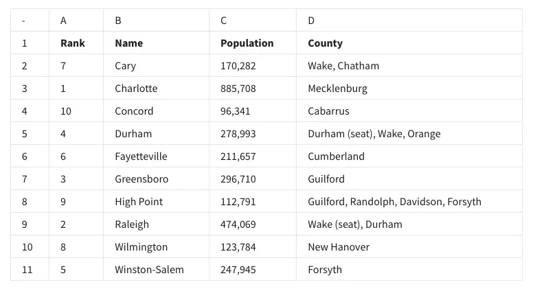
21. In the following spreadsheet, where can you find all of the attributes—also known as the observation—of Fayetteville?

- Row 7 ✅
- Column B
- Row 6
- Cell B7
Explanation:
An observation refers to all data points for a specific entity in a dataset. If Fayetteville’s data is in row 7, then all its attributes are located in that row.
22. Fill in the blank: In the following spreadsheet, the feature sort range can be used to ________ the city names in column B?

- change
- alphabetize ✅
- randomize
- delete
Explanation:
The “sort range” feature allows users to organize data in a specific order, such as alphabetizing city names in a column.
23. The function =AVERAGE(C2:C11) can be used to do what for the following spreadsheet?

- Arrange the rows according to increasing population size.
- Find the city with the largest population.
- Arrange the rows according to decreasing population size.
- Find the average population of the cities ✅
Explanation:
The AVERAGE function calculates the mean of the numbers in the specified range, which in this case represents the populations of the cities.
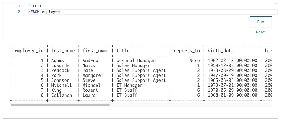
24. You are working with a database table named employee that contains data about employees. You want to review all the columns in the table.
You write the SQL query below. Add a FROM clause that will retrieve the data from the employee table.

What employee has the job title of Sales Manager?
- Nancy Edwards ✅
- Margaret Park
- Michael Mitchell
- Andrew Adams
Explanation:
Using the query SELECT * FROM employee
, you can retrieve all data from the “employee” table. The correct data identifies “Nancy Edwards” as the Sales Manager.
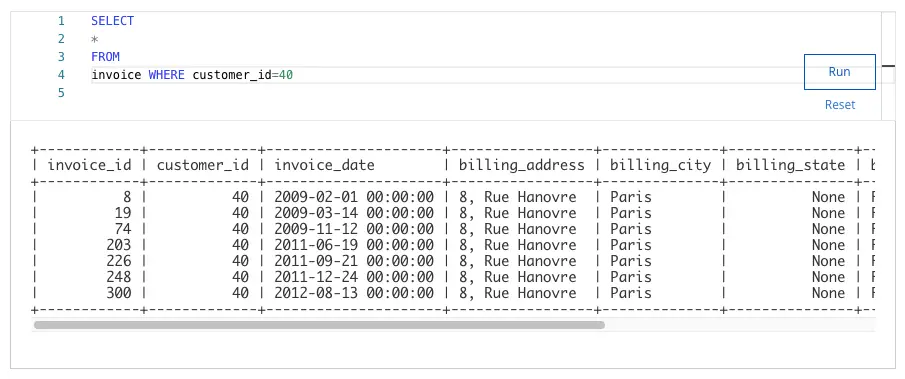
25. You are working with a database table that contains invoice data. The customer_id column lists the ID number for each customer. You are interested in invoice data for the customer with ID number 40.
You write the SQL query below. Add a WHERE clause that will return only data about the customer with ID number 40.

After you run your query, use the slider to view all the data presented.
What is the billing city for the customer with ID number 40?
- Paris ✅
- Dijon
- London
- Buenos Aires
Explanation:
The SQL query SELECT billing_city FROM invoices WHERE customer_id = 40;
returns the billing city for the specified customer, which is Paris.
26. A data analyst has to create a visualization that makes it easy to show which of the top ten most populous cities in North Carolina have a population below 250,000 people. What type of chart would be best for this visualization?
- Line chart
- Pie chart
- Bar chart ✅
- Scatter chart
Explanation:
A bar chart is ideal for comparing populations because it visually represents data using bars, making it easy to identify cities with populations below 250,000.
27. A data analyst wants to demonstrate how the population in Charlotte has increased over time. They create this data visualization. This is an example of an area chart.

- True
- False ✅
Explanation:
An area chart fills the space below the line to emphasize volume, but to show trends over time, a line chart is typically more appropriate.
28. In row 1 of the following spreadsheet, the words rank, name, population, and county are called what?

- Attributes ✅
- Descriptors
- Criteria
- Characteristics
Explanation:
Attributes are column headers that describe the type of data in each column.
29. In the following spreadsheet, what feature was used to alphabetize the city names in column B?

- Organize range
- Sort range ✅
- Name range
- Randomize range
Explanation:
Sort range arranges data in ascending or descending order based on selected cells or columns.
30. To find the average population of the cities in this spreadsheet, you type =AVERAGE. What is the proper way to type the range that will complete your function?

- (C2,C11)
- (C2-C11)
- (C2:C11) ✅
- (C2*C11)
Explanation:
This is the correct range format in Excel/Sheets functions.
Hope this helped! Use the buttons below to move to the previous or next part.