
31. Scenario 2, continued
A teammate creates a new plot based on the chocolate bar data. The teammate asks you to make some revisions to their code.
Assume your teammate shares the following code chunk:
ggplot(data = best_trimmed_flavors_df) +
geom_bar(mapping = aes(x = Rating)) +
What code chunk do you add to the third line to create wrap around facets of the variable Rating?
- facet_wrap(~Rating)
- facet_wrap(Rating)
- facet(~Rating)
- facet_wrap(Rating~)
32. Scenario 2, continued
Your team has created some basic visualizations to explore different aspects of the chocolate bar data. You’ve volunteered to add titles to the plots. You begin with a scatterplot.
Assume the first part of your code chunk is:
ggplot(data = trimmed_flavors_df) +
geom_point(mapping = aes(x = Cocoa.Percent, y = Rating)) +
What code chunk do you add to the third line to add the title Best Chocolates to your plot?
- labs(“Best Chocolates”)
- labs(“Best Chocolates” = title)
- labs(title <- “Best Chocolates”)
- labs(title = “Best Chocolates”)
33. Scenario 1, questions 1-7
As part of the data science team at Gourmet Analytics, you use data analytics to advise companies in the food industry. You clean, organize, and visualize data to arrive at insights that will benefit your clients. As a member of a collaborative team, sharing your analysis with others is an important part of your job.
Your current client is Chocolate and Tea, an up-and-coming chain of cafes.
The eatery combines an extensive menu of fine teas with chocolate bars from around the world. Their diverse selection includes everything from plantain milk chocolate, to tangerine white chocolate, to dark chocolate with pistachio and fig. The encyclopedic list of chocolate bars is the basis of Chocolate and Tea’s brand appeal. Chocolate bar sales are the main driver of revenue.
Chocolate and Tea aims to serve chocolate bars that are highly rated by professional critics. They also continually adjust the menu to make sure it reflects the global diversity of chocolate production. The management team regularly updates the chocolate bar list in order to align with the latest ratings and to ensure that the list contains bars from a variety of countries.
They’ve asked you to collect and analyze data on the latest chocolate ratings. In particular, they’d like to know which countries produce the highest-rated bars of super dark chocolate (a high percentage of cocoa). This data will help them create their next chocolate bar menu.
Your team has received a dataset that features the latest ratings for thousands of chocolates from around the world. Click
here
to access the dataset. Given the data and the nature of the work you will do for your client, your team agrees to use R for this project.
A teammate asks you about the benefits of using R for the project. You mention that R can quickly process lots of data and create high quality data visualizations. What is another benefit of using R for the project?
- Choose a topic for analysis
- Easily reproduce and share an analysis
- Automatically clean data
- Define a problem and ask the right questions
34. After completing your analysis of the rating system, you determine that any rating greater than or equal to 3.9 points can be considered a high rating. You also know that Chocolate and Tea considers a bar to be super dark chocolate if the bar's cocoa percent is greater than or equal to 75%. You decide to create a new data frame to find out which chocolate bars meet these two conditions.
Assume the first part of your code is:
best_trimmed_flavors_df <- trimmed_flavors_df %>%
You want to apply the filter() function to the variables Cocoa.Percent and Rating. Add the code chunk that lets you filter the data frame for chocolate bars that contain at least 75% cocoa and have a rating of at least 3.9 points.
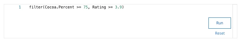
What value for cocoa percent appears in row 1 of your tibble?
- 78%
- 75%
- 80%
- 88%
35. Now that you’ve cleaned and organized your data, you’re ready to create some useful data visualizations. Your team assigns you the task of creating a series of visualizations based on requests from the Chocolate and Tea management team. You decide to use ggplot2 to create your visuals.
Assume your first line of code is:
ggplot(data = best_trimmed_flavors_df) +
You want to use the geom_bar() function to create a bar chart. Add the code chunk that lets you create a bar chart with the variable Company.Location on the x-axis.
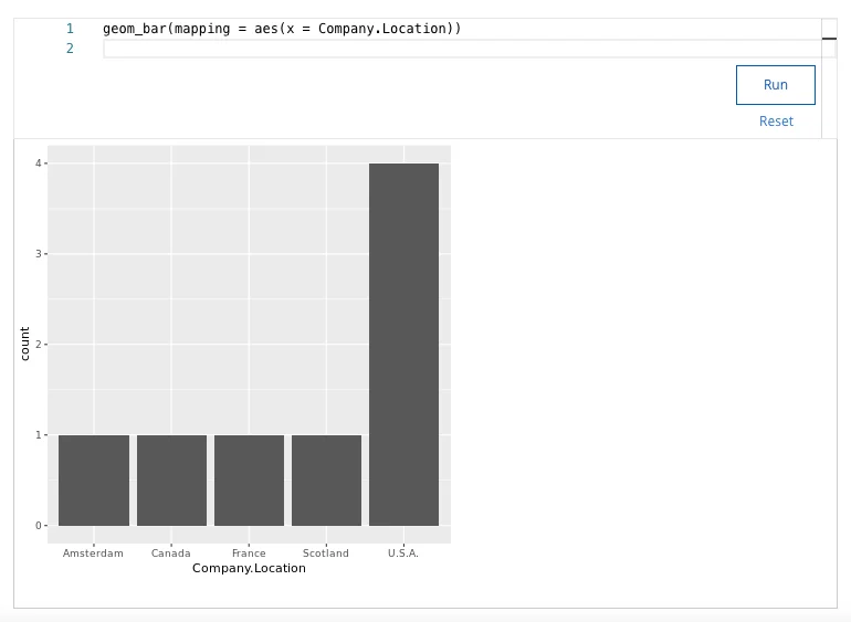
How many bars does your bar chart display?
- 3
- 6
- 5
- 4
